
Onboarding built for Ontario’s rules
Ontario requires identity, address and occupation checks before anyone can play. Only 31.1% of new players finished the old flow. We separated login from sign-up and moved document verification to the front.
- Brand
- Ontario casino brand
- Market
- Ontario, Canada
- Platform
- Mobile web
- Role
- Lead product designer: research, UX and UI
Tools: Jira, Miro, Pip Decks, Looker, Sentry, GA4, Maze, Figma, Airtable
Context
In Ontario, players must be 19 or older, and the operator has to verify who they are, where they live and what they do for work before they can play. Every step of that is required. The question was how to ask for it without losing people.
The existing flow used one form for both login and registration. Every new player went through automated identity verification with GBG, and many of them were still asked to upload documents afterwards.
- of users verified automatically through GBG
- 62.2%
- went through the third-party KYC tool, Veriff
- 37.8%
- actually finished the onboarding journey
- 31.1%
My role
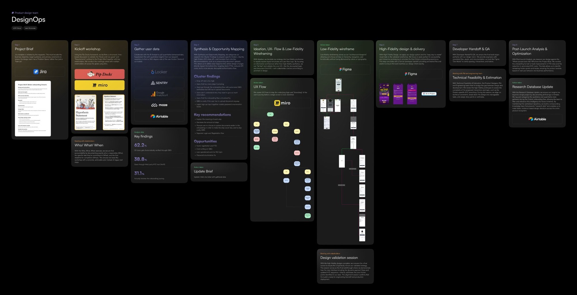
I owned both the research and the design. I wrote up the data with our BI analyst, ran the synthesis, mapped the flows, and designed the wireframes and final UI, taking the project through every step of the team process from brief to handoff.
Process
What the research said
- The drop-off rate was too high, and users found the number of steps frustrating.
- Users who passed automated GBG verification still had to upload documents.
- People didn’t understand why they needed to give so much information, and found the flow untrustworthy.
- GBG checks were a wasted cost whenever the user had to upload documents anyway.
- Combining login and sign-up inputs created a password-enumeration risk.
What we recommended
- Explain the meaning of each step.
- Cut the number of steps.
- Offer document upload early, so players who will need it anyway skip the costly GBG check and an extra step.
- Separate the login and registration flows.
What changed
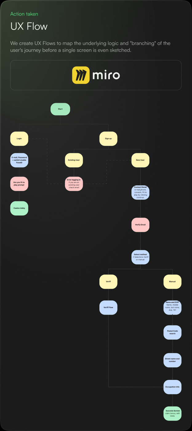
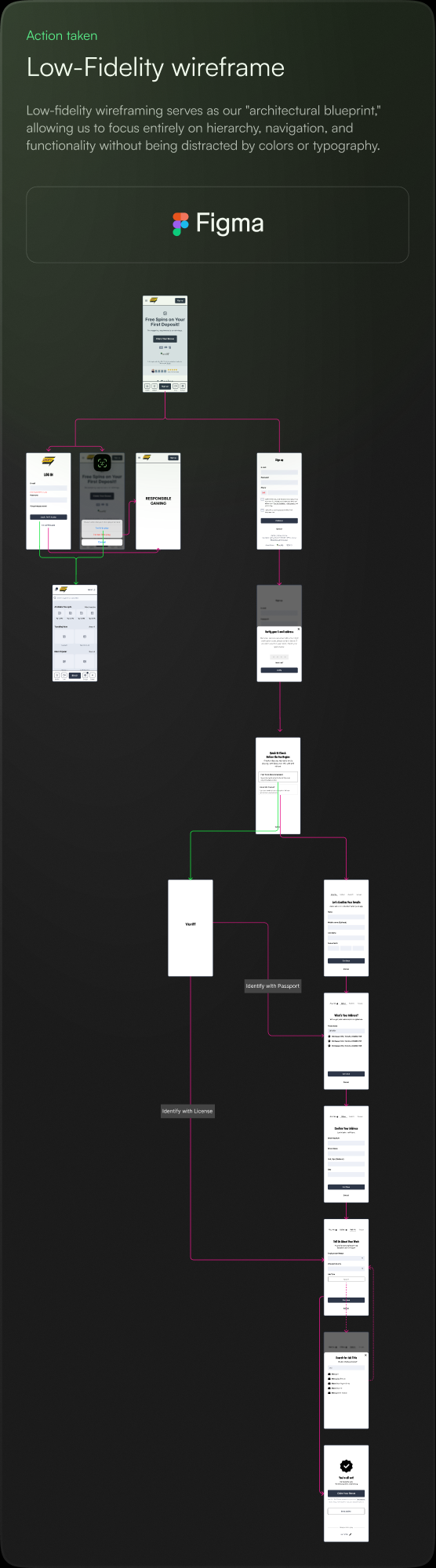
- Login and sign-up are separateEach has its own entry point. If an existing player starts signing up, they are pointed to login instead. This closed the enumeration issue and got returning players to the lobby faster.
- Verification method is chosen up frontA “Quick ID check” screen offers Fast Track (photo of an ID, handled by Veriff, recommended) or entering details by hand. Players who need documents provide them first, instead of after a GBG check.
- Each requirement says whyCopy ties every ask to the regulation: “Ontario requires a few quick checks before you can play” and “Required by Ontario regulations to help keep gaming safe for everyone.”
- Less typingManual entry is four labelled stages: about you, address, work info and done. A postal-code search suggests full addresses, and job titles are searchable.
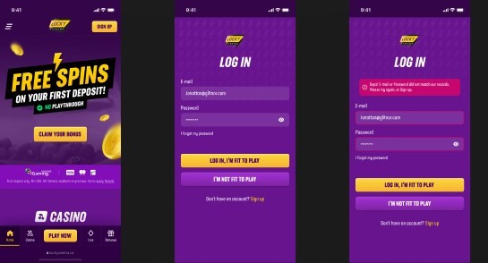
- Responsible gaming at the doorThe login screen asks players to confirm “Log in, I’m fit to play” or choose “I’m not fit to play”. The success screen offers the bonus and a direct route to set limits.
Outcome
The redesign targeted four outcomes: faster registration and first-time deposit, lower GBG verification costs, less manual work for the responsible-gaming team, and a fix for password enumeration.
After launch the onboarding funnel is tracked against the KPIs in the brief, mainly first-time-deposit rate and automated KYC cost.